Tuesday, 29 November 2011

Virtual Essay – Option # 2


While doing research for my photo journal: part 2 I recently discovered David LaChapelle’s work.  I found his website and immediately fell in love with his work. I love how over the top and vibrant each photo is. LaChapelle’s work tells a whole story in one frame. And I love how even though there is so much going on, the focus is still on the model.
When I first saw this assignment, I was going to get my friend Sarah, who is a great photographer and take some pictures inspired by David LaChapelle, but due to camera malfunctions, I decided to start looking for another photographer whose work reminded me of LaChapelle.

It was when I was watching America’s Next Top Model, one of my guilty pleasures, that I noticed how similar the work of Photographer/ Judge Nigel Barker  was to that of LaChapelle’s. So I researched his work, I and realized that a lot of his pictures reminded me of much tamer versions of David LaChapelle’s work , and so I decided to uses the work of these two photographers for my virtual essay. 

Nigel Barker
source

Nigel Barker
source

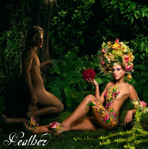
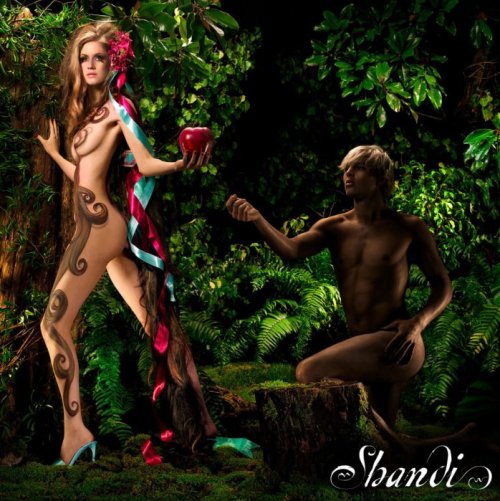
This is the first set of pictures that I found by Nigel Barker that reminded me of David LaChapelle. They’re from cycle 2 of America’s Next Top Model, where the girls participated in an “Adam and Eve” themed shoot and were covered in body paint instead of clothes. They reminded me of David LaChapelle's picture of Godzilla in the Jungle with Lady Gaga and Kanye West. 


David LaChapelle
source


An obvious similarity between the two pictures is the jungle theme background. Another similarities is in the  lighting, since it seems to be focused on the female instead of the male. In both photos, my eye is drawn to the female first. In Nigel's photos, the male model is just a part of the background, and in LaChapelle's photo, I feel like Kanye West is more of a prop holding Lady Gaga, than as a focal point of the picture. A lot of the same colors are used in both photos, such as green, yellow, red and orange. 

The next similarity I saw was how the models were directed to pose. In the pictures above, the female models are sitting or carried in the same pose. I found another picture by David LaChapelle of Alan Cumming (below) and thought the pose was also very similar to poses of models from the same shoot as above by Nigel Barker. 

David LaChapelle
source
Nigel Barker
source

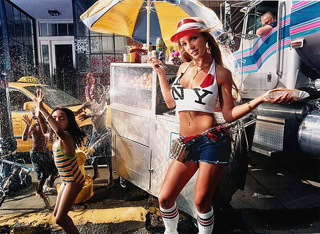
The next picture I found was of Britney Spears by David LaChapelle. It automatically reminded me of an episode of America's Next Top Model where the girls had to model on a beach with a bunch of people in the background and still remain the focus of the picture. I remembered Nigel Barker was the photographer for the shoot. Both pictures are similar because one frame tells a whole story, there's a lot going on in both photos but the model remains the focus. 

David LaChapelle

Nigel Barker
source

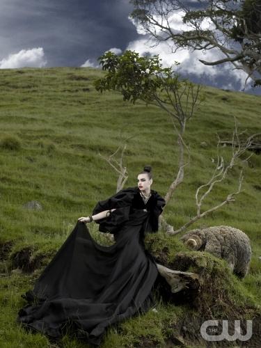
The next set of similar pictures I found are of Alexander McQueen (David LaChapelle) and from cycles 11and 14 of America's Next Top Model (Nigel Barker). 

David LaChapelle
source


Nigel Barker
source

I think that the two of these photos are similar in the way that they are lit; they both have a very dark feeling to them. The colors of the hot balloon of Nigel's photo remind me of the colors of the dress in LaChapelle's photo. The big flow-y dresses are also another similarity in the two photographs and are used to give the photo direction. 

I think David LaChapelle and Nigel Barker have similar photography styles because they are both heavily involved in the process. It doesn't seem like any of the photos happen by chance, it seems like both photographers have a certain image in their minds that they are trying to capture and they control every aspect of their photos to ensure that have the final product that they are looking for. 

Tuesday, 15 November 2011

Discussion Board - Week # 11

DB - Week #11

Compare the work of Andre Kertesz and Henri Cartier-Bresson versus the work of Eugene Smith and Sebastio Salgado. They are photojournalist with different approaches.
1.People and Shadows - Andre Kertesz
     2. Arm and Ventilator - Andre Kertesz
3. Henri Carter-Bresson FRANCE.
1932 
Paris. Place de l'Europe.Gare
Saint Lazare.
4. Henri Carter-Bresson. USA. 1947. Fire in Hoboken,
 facing Manhattan
                   

5. Spanish Wake -Eugene Smith

6. The Walk to Paradise Garden -
 Eugene Smith

7. The Refugees: Iraqi Kurdistan -Sebastiao Salgado

8. The Dispossessed -Sebastiao Salgado

 What are the main differences and similarities?

The main difference between Andre Kertesz and Henri Cartier-Bresson versus Eugene Smith and Sabasito Salgado would be there level of visibility each photographer had as they captured an image.  Andre Kertesz and Henri Cartier-Bresson both believed they needed to be “invisible” when taking photos (Icevska, Week 10) whereas Eugene Smith & Sebastiao Salgado did not.

Andre Kertesz is  a pioneer of photojournalism. He waited until the right moment to capture his image. He could capture a moment by feeling it instead of having to stage it. He thought that "the subject offered itself to me and I took advantage"(Icevska,Week 10). 

Henri Carter-Bresson is considered a godfather of photojournalism. He also believed in not interrupting the scene and capturing the images around him without changing them, sometimes having to "approach the subject on tiptoe" (Icevska, Week 10) to get his shot.

On the other hand, Eugene Smith and Sabasito Salgado were very “visible” when they captured an image. Smith especially, was known to become close to the subjects of his pictures (Icevska, Week 11). He would also edit his work in the dark room before he felt they reflected what he was trying to capture. An example of this is his picture, Spanish Wake, Smith adjusted the light so that the audience would see the picture the way he wanted them to, instead of seeing the image that was really captured (Icevska, Week 11).

 Much like Eugene Smith, Sebastiao Salgado interacted with the people who were in his photographs. He felt that he had to enter the circle, almost becoming the people he would photograph, so he could better understand the existence of the people (Icevska,Week 11).

The main similarities between these four photographers are that they all captured real life events/moments. After viewing their photos, you can see that no matter how visible or invisible these photographers were in the process, they all captured true emotion. 

What’s the better journalistic approach?

The Code of Ethics of the National Press Photographers Association state that photojournalists should respect the integrity of the photographic moment. The long postproduction process, regardless if it is in a dark room or on a computer using a program such as Photoshop, is contrary to the basic principles of photojournalism. Photojournalists should also “resist being manipulated by staged photo opportunities”. (Icevska) Taking this into consideration, it seem that Andre Kertesz and Henri Cartier-Bresson have the better journalistic approach.

Kertesz said “I never had to go very far for subjects; they were always on my doorstep. But I can’t analyze it. People ask me how I did it. I don’t know; the event dictated it.” (Icevska) This quote is a pretty accurate description of what photojournalism is.

While Smith and Salgado's photographs are excellent images, they are in fact edited so they do not show an accurate version of the truth. Also, some people might be shy around cameras and not give 100% of themselves and their emotions if they know they're in a photograph, whereas if it's a candid photograph and they don’t know they are in a photo, their true emotions are more likely to show.


Photos:


1. "Study of People and Shadows, Paris (Getty Museum) ." The Getty. N.p., n.d. Web. 10 Nov. 2011. http://www.getty.edu/art/gettyguide/artObjectDetails?artobj=62327 .

2. "Arm and Ventilator, New York (Getty Museum) ." The Getty. N.p., n.d. Web. 10 Nov 2011. http://www.getty.edu/art/gettyguide/artObjectDetails?artobj=62352 .

3. Henri Cartier - Bresson. (n.d.).Magnum Photos. Web. 11 Nov, 2011,

4.  Henri Cartier - Bresson. (n.d.).Magnum Photos. Web. 11 Nov, 2011,


7.  "Outcast: Displaced People of the World 3/17/2000." Breaking News, Analysis, Politics, Blogs, News Photos, Video, Tech Reviews - TIME.com. N.p., n.d. Web. 12 Nov. 2011. http://www.time.com/time/daily/special/photo/salgado/3.html .

8. "Outcast: Displaced People of the World 3/17/2000." Breaking News, Analysis, Politics, Blogs, News Photos, Video, Tech Reviews - TIME.com. N.p., n.d. Web. 12 Nov. 2011. http://www.time.com/time/daily/special/photo/salgado/3.html .

References

Gordana, Icevska. Photography: Shooting the Truth, Presentation Week 10
Gordana, Icevska. Photography: Shooting the Truth, Presentation Week 11 

Sunday, 6 November 2011

Assignment # 1 ~ Photo Journal ~ Part # 2

Art Photography vs. Press Photography

1.) Lady Gaga - David LaChapelle 
2.) Lady Gaga and Kayne West - David La Chapelle
3.) Henri Carter-Bresson
USA. 1947. Fire in Hoboken, facing Manhattan
 4.) Henri Carter-Bresson
FRANCE. 1932
Paris. Place de l'Europe.
Gare Saint Lazare. 

          I believe that the two press photographs and the two art photographs I have chosen are completely different from each other. When looking at the two art photographs by David LaChapelle, you can tell that the photographer planned every detail of the shoot and that he is highly visible. In the two press photographs by Henri Cartier-Bresson, you can tell that these photographs weren’t planned and the photographer is invisible. In the art photos, especially the one with Lady Gaga and Kayne West, you can tell that this photo was edited after the picture was taken (examples: the volcano in the background and Kayne West’s eyes), whereas the press photographs look unedited.

Charles Caffin said “There are two distinct roads in photography – the utilitarian and the aesthetic: the goal of one being a record of facts, and the other an expression of beauty” (Icevska). I believe that art photography is an expression of beauty, and it’s supposed to be enjoyed for what it is. Therefore, I think it’s acceptable and ethical to alter art photographs. Most art photographers may have an image in their mind of what they are looking to capture, and since their photograph will be used as an expression of beauty, I believe that it’s okay for the photographer to edit the photo after the picture is taken to make it into the photo they imagined.

As Charles Caffin says in the quote above, I think that the goal of press photography is to record the facts. Both Andre Kertesz and Henri Cartier-Bresson thought they needed to be invisible when taking photos (Icevska). I do agree that as a photojournalist you should be invisible when taking photos, and therefore I think that it is neither ethical nor acceptable to alter press photographs. By altering press photographs you are essentially removing the truth behind the photo. If the photographer has staged the shot, or changes parts of the photo (such as lighting or cropping) to pull the eye to a certain part of the picture, I believe that the photo is no longer showing the truth because it has been manipulated to draw your eye to what it is the photographer wants you to see instead of seeing exactly what the situation was.


References:
1.     Icevska, Gordana "Shooting the Truth" Week 4
2.    Icevska, Gordana  "Shooting the Truth" Week 10 


Pictures Sources:
1.    LaChapelle Studio - Portraits - Lady Gaga. (n.d.). LaChapelle Studio. Retrieved Nov, 05th , 2011, http://www.lachapellestudio.com/portraits/lady-gaga/?ci=112 
2.    LaChapelle Studio - Portraits - Lady Gaga. (n.d.). LaChapelle Studio. Retrieved Nov, 05th , 2011, http://www.lachapellestudio.com/portraits/lady-gaga/?ci=112


Tuesday, 4 October 2011

Assignment # 2 ~ Photo Manipulation


When I was in high school I became interested in photography, so I started taking a photography course. It was just an introduction course and where I only learned the basics, but ever since then I sometimes like to pretend I'm a photographer. I also used to dance competitively, so I would often use the girls on my team as subjects. Now let’s be honest, an introduction class will only get you so far. I don't care how many pictures you take, sometimes I can't make my camera capture the image I have in my head. That is where Photoshop and Photo editing come in to help me mould that image until it resemble the finished product I am aiming for.

At a competition I was at, I took a picture of some of my team when they were performing a dance called “Colour Blind”.  The song they used  was very dramatic as were the costumes, so I wanted a dramatic picture to represent this piece. However it is hard to capture the perfect image when people are not posing but moving around (in this case dancing). So I waited until the dancers where suspended in a moment in the piece and I finally capture the image I was looking for. Later when I went to look at the photo I felt like something was missing, it wasn’t quite the dramatic image I was trying to get a cross. By playing around with all the features on Picnik I created the image I couldn't get my camera to capture. 


(Thank you Picnik)


Although sometimes tools like Photoshop and photo editing can be what save a picture, there is such thing as too much editing. For example, I have a favourite baby picture of myself. I'm in my crib about to make my escape ( you can tell by the mischievous smile ) I am clearly trying to escape because my parents for some reason thought it would be ok to terrorize their daughter by hanging clowns above her bed. Also I had always liked it because of how the bright baby blue colour in the background stood out, but I wanted to see what it would look like if I played around with it on Picnik. First I tried the camera tool called “1960’s” to make it look older and more vintage, to show it was a moment from the past.


Although the “1960’s” camera tool definitely made the picture look older, it removed one of my favourite parts of the picture, the vibrant baby blue background of the room. So then I tried to bring the colours out in the photo by using the “Vibrant” camera tool to make the colour of the background really pop out.    


 The result is an a bit messy, I definitely was not the colour of an orange as a baby.  So really, not what I was going for. Although it looks kind of cool, I felt like it was still missing something. So I left the picture in its original state.


There are definitely imperfections in the original. It's not exactly focused and the colors don't pop as much as they should, it's the imperfections that photo editing would make perfect, that make this picture perfect to me. 

Photo editing tools are definitely awesome and great to use. They can completely change your picture and make the picture tell a whole different story. But as with any good thing, there's such thing as too much. Sometimes the imperfections make a picture perfect!